


Full-cycle UX/UI designer with 7+ years of international experience across banking, automotive, retail, logistics, and more. From research to delivery.
I'm a UX/UI Designer based in Milan with international experience across Italy and China. I specialise in enterprise platforms and user-centered design, working across the full product cycle — from research and co-design to prototyping, testing, and delivery.
What drives me is making complex systems simple, accessible, and business-aligned. I believe in transparency, inclusivity, and usability as the foundation of impactful digital products.
Leroy Merlin is a global DIY retail giant — 456 stores across 15 countries. But behind the scenes, store operators were still relying on old, fragmented desktop tools to manage stock movements, incoming goods, and customer orders. No real-time visibility. No communication between warehouses and stores. High error rates. High manual workload. The customer promise — getting the right product, at the right time — was simply not reliable. I was brought in to fix that.
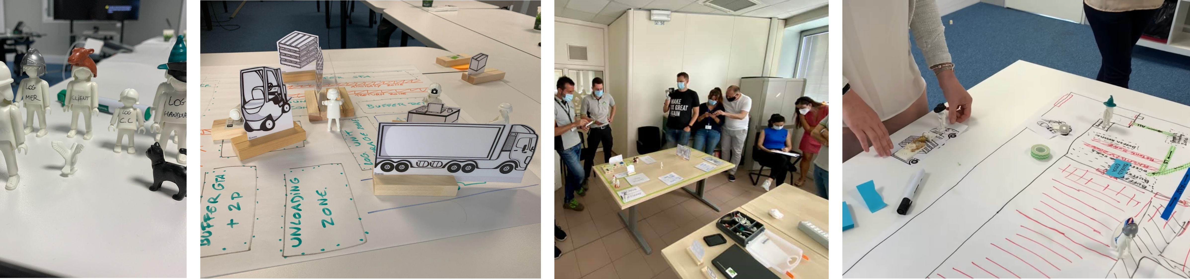
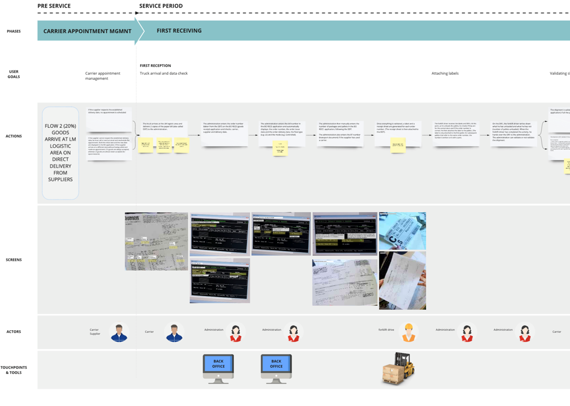
I joined as the UX lead from Italy, acting as the bridge between three countries: I collected real-world pain points from Italian store workers on the field, collaborated with the French product team to align on requirements, and handed over specs to the Russian development team. My job was to make sure everyone — from the warehouse operator to the product owner in Paris — was working towards the same vision.


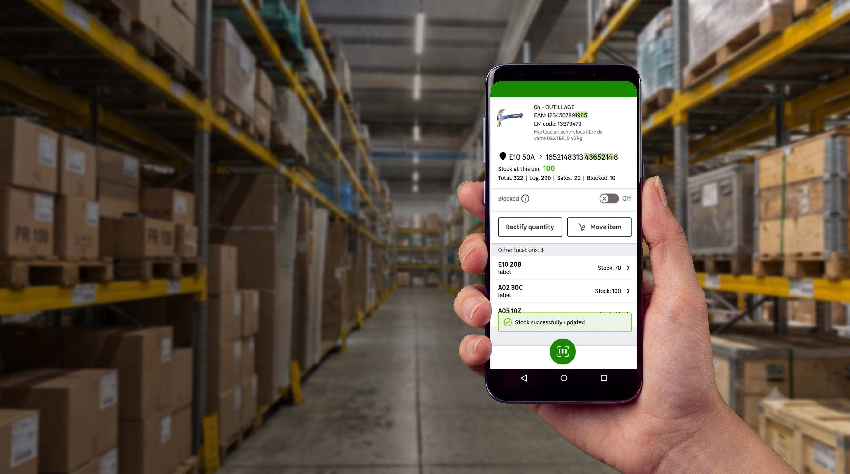
I designed an integrated ecosystem of tools built around real store needs — shifting from fragmented, paper-based processes to a unified, intuitive digital experience across all operations and countries.
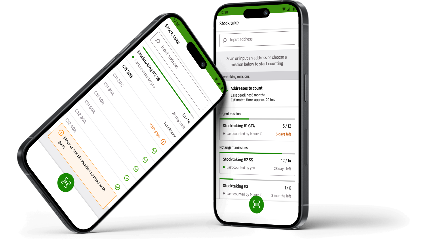
The teams I designed for needed almost no training — the apps were that intuitive. What used to be a fragmented, error-prone process became a single, seamless mobile experience I helped ship across 9 countries. "Few need to train employees to use our products because they are so intuitive." — Virginie, Product Owner, France.
Apps developed
Countries involved
People involved
Maps created
Wireframes designed
Prototypes produced
User tests leaded
Design reviews realised
Even after the apps were released, I continued to support them. I evaluate products, processes and experiences through a continuous improvement loop. I do this because:
 25
25
"This new way of working allows us to develop the business strategy according to the needs of our supply teams and vice versa."
"Few need to train employees to use our products because they are so intuitive."
"More than processes, working on the user experience facilitates the appropriation and the contribution of value."
"This new way of working allows me to have a 360° vision, to have full awareness of the whole process and possible pain points, building and testing functionalities before production."
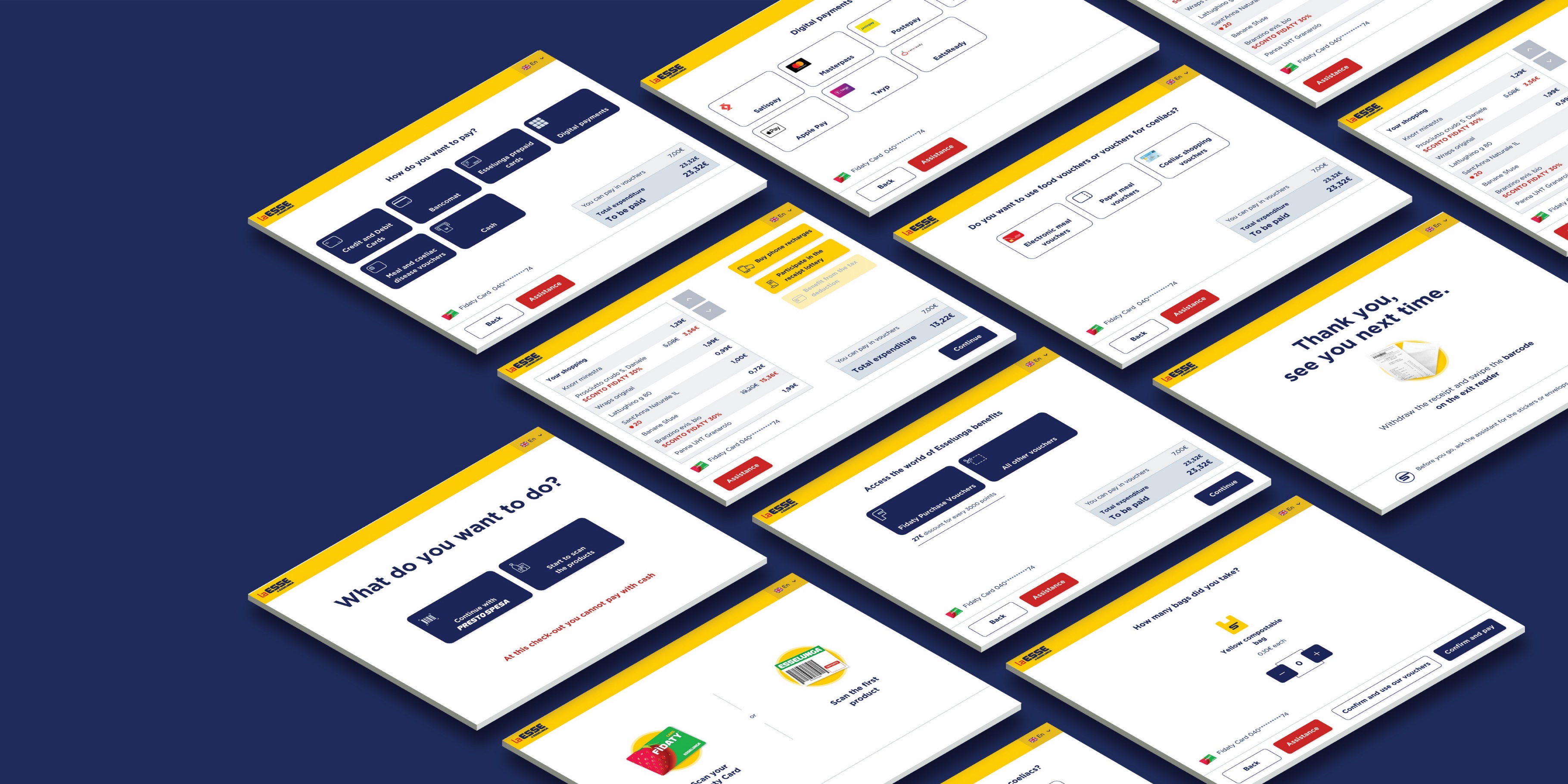
Esselunga needed to improve the self-checkout experience to make it faster, clearer and easier to use for different types of customers. The existing flows included several steps, payment options, vouchers, discounts and service variations, creating possible confusion during checkout.
Goal: create a more intuitive and scalable checkout flow that reduces the need for staff assistance and supports future services.
I worked on the redesign of the self-checkout UX/UI, focusing on simplifying complex flows and creating a clearer interface for customers in-store.
I analyzed the existing checkout flows to identify bottlenecks, redundant steps and unclear decision points. The analysis focused especially on payment, vouchers, discounts and the transition between Presto Spesa and self-checkout experiences. The research phase helped define where users needed more guidance, clearer labels and stronger visual hierarchy.
I defined a unified future flow that merged Presto Spesa and self-checkout into a hybrid, simplified experience. The flow was structured around the core checkout moments:
This created a more linear and predictable experience for customers.
I created low-fidelity screens and high-fidelity prototypes to test the redesigned checkout experience before final delivery. The usability test involved 10 users across 3 age groups: under 35, 35–55 and over 55. Sessions lasted around 20 minutes and focused on core checkout tasks using interactive prototypes.
Testing helped identify issues around:
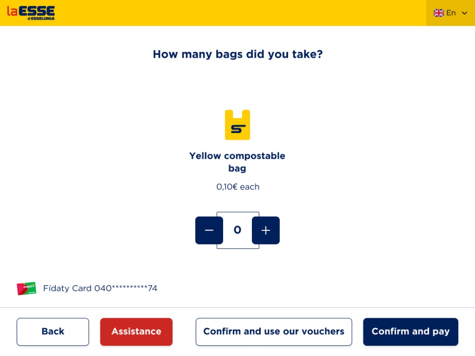
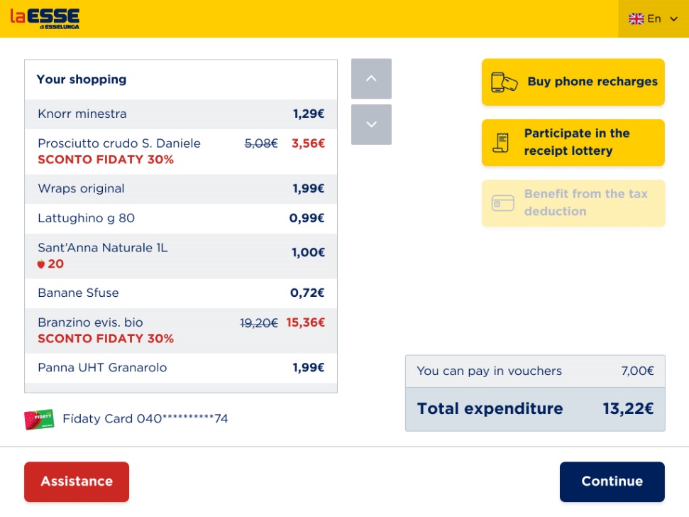
The final interface simplified the checkout experience with clearer steps, stronger visual hierarchy and modular UI components.
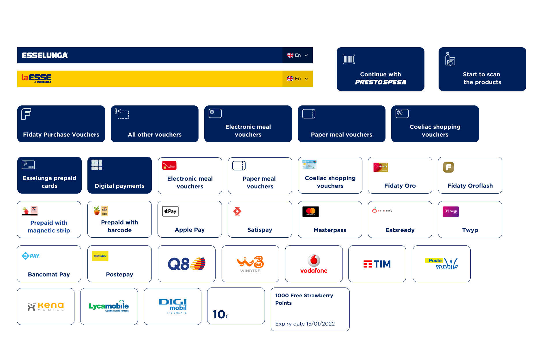
I built a modular component system aligned with Esselunga's identity, designed for fast recognition in a retail environment. The interface was also checked against WCAG 2.1 using contrast tests and color blindness simulations. Key components met AA/AAA readability criteria.
Self-checkout design requires extreme clarity. Users are often in a hurry, distracted or under pressure, so every label, icon and step must reduce uncertainty. The strongest improvements came from simplifying decisions, making payment options more explicit and validating readability across different user groups.
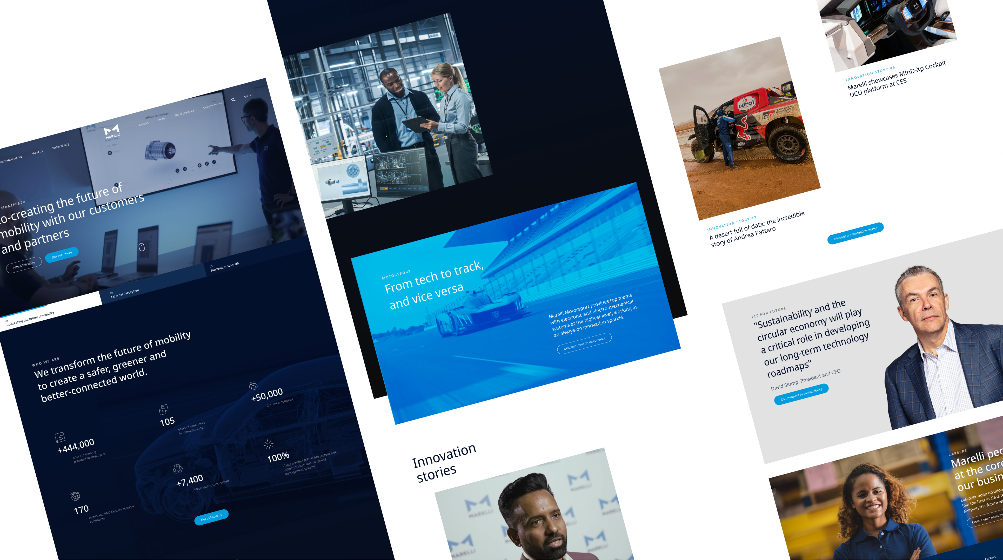
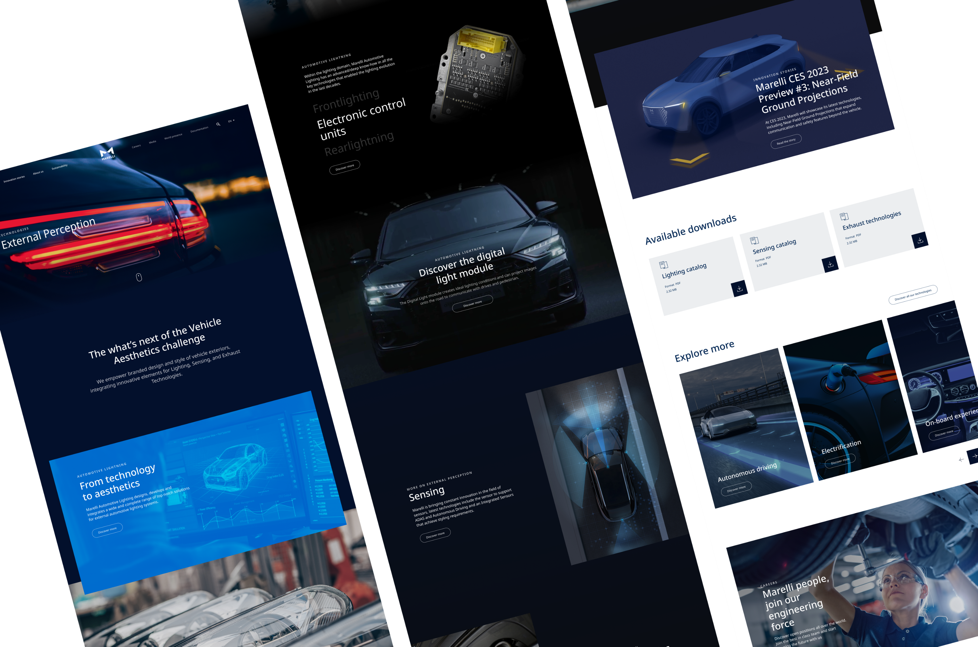

From product-centric B2B supplier focused on parts, to an innovation-focused mobility solutions leader with a purpose-driven, people-centred digital identity.
Reduced friction and faster user journeys
Consolidated brand communication and services
Stronger positioning in innovation and future mobility
Easy integration of future business areas
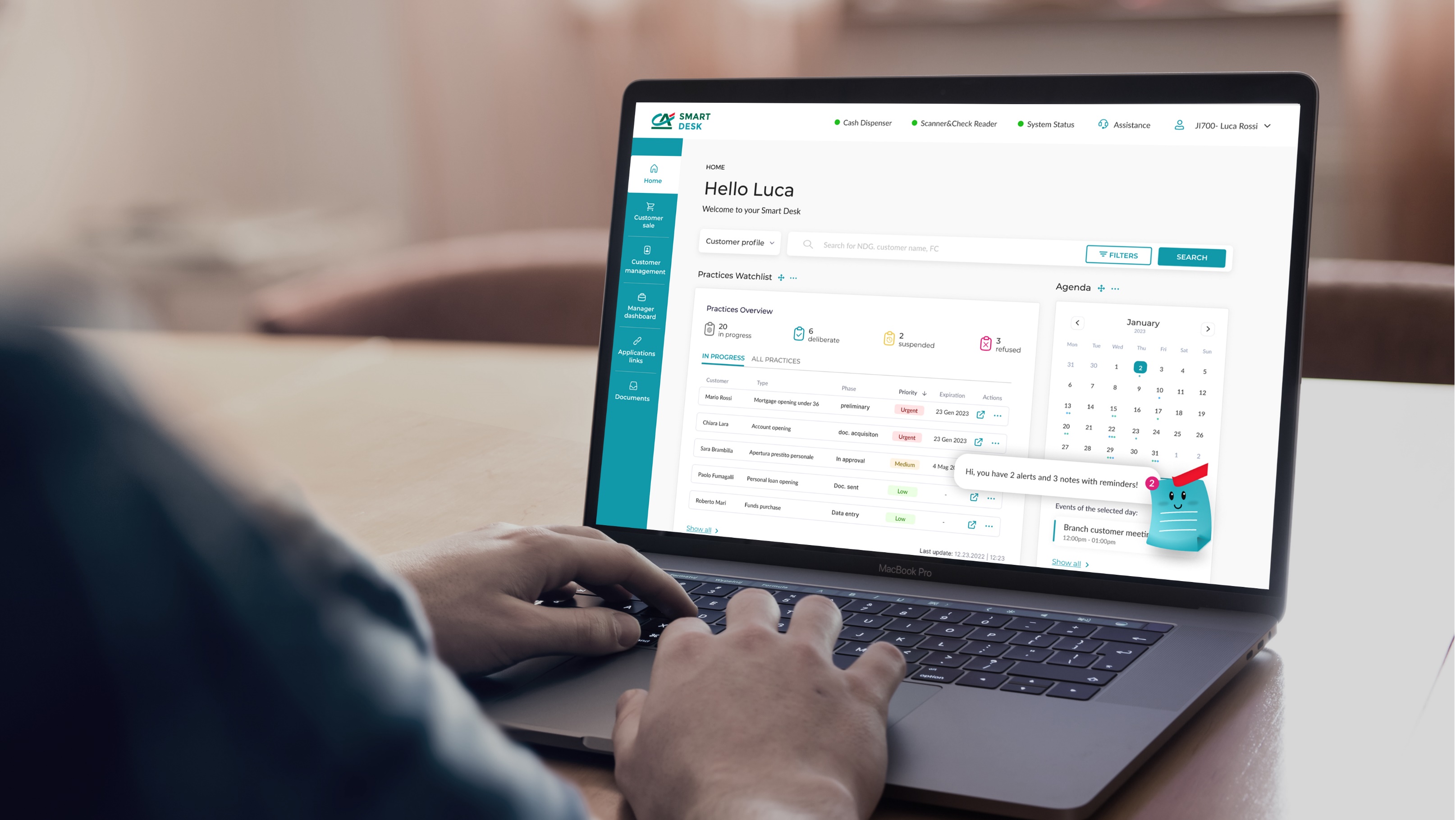
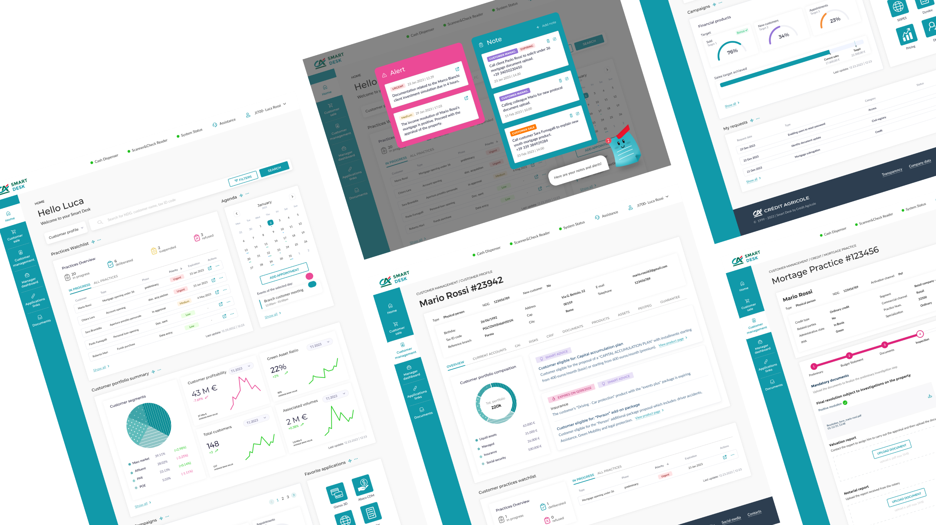
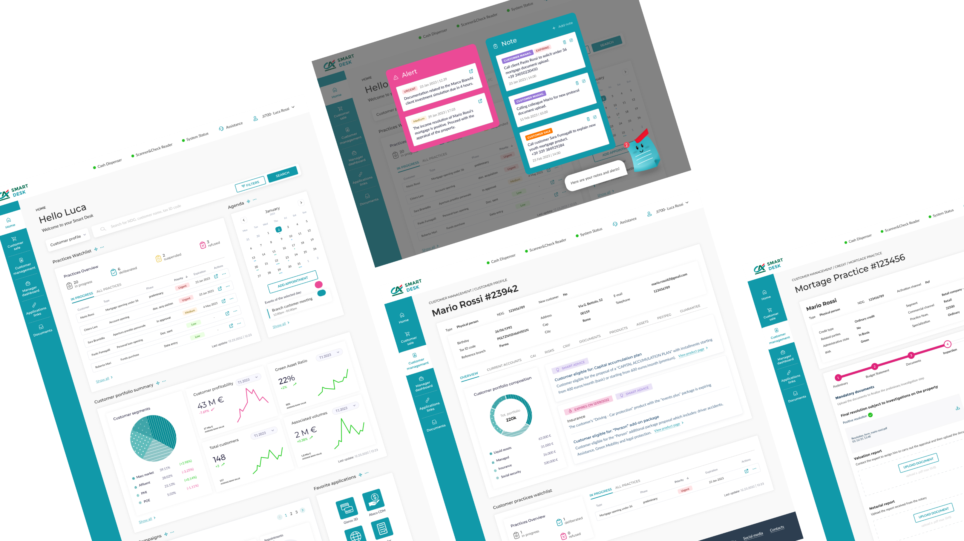
A single digital touchpoint replacing fragmented tools — integrating agendas, customer portfolios, procedures, tasks, and campaign tracking into one cohesive platform for Crédit Agricole advisors.
Homepage integrates smart search, agenda, and prioritised task list. The "Sticky" virtual assistant manages reminders and alerts with visual cues to keep the workflow under control.
Dashboard highlighting key KPIs — profitability, customer segments, and volumes — plus campaign tracking, shortcuts to key tools, and pending request monitoring to enhance advisor autonomy.
Reduced time-to-action across daily tasks
Fragmented tools → one cohesive system
Simplified access to critical customer data
Easily extendable to future banking services
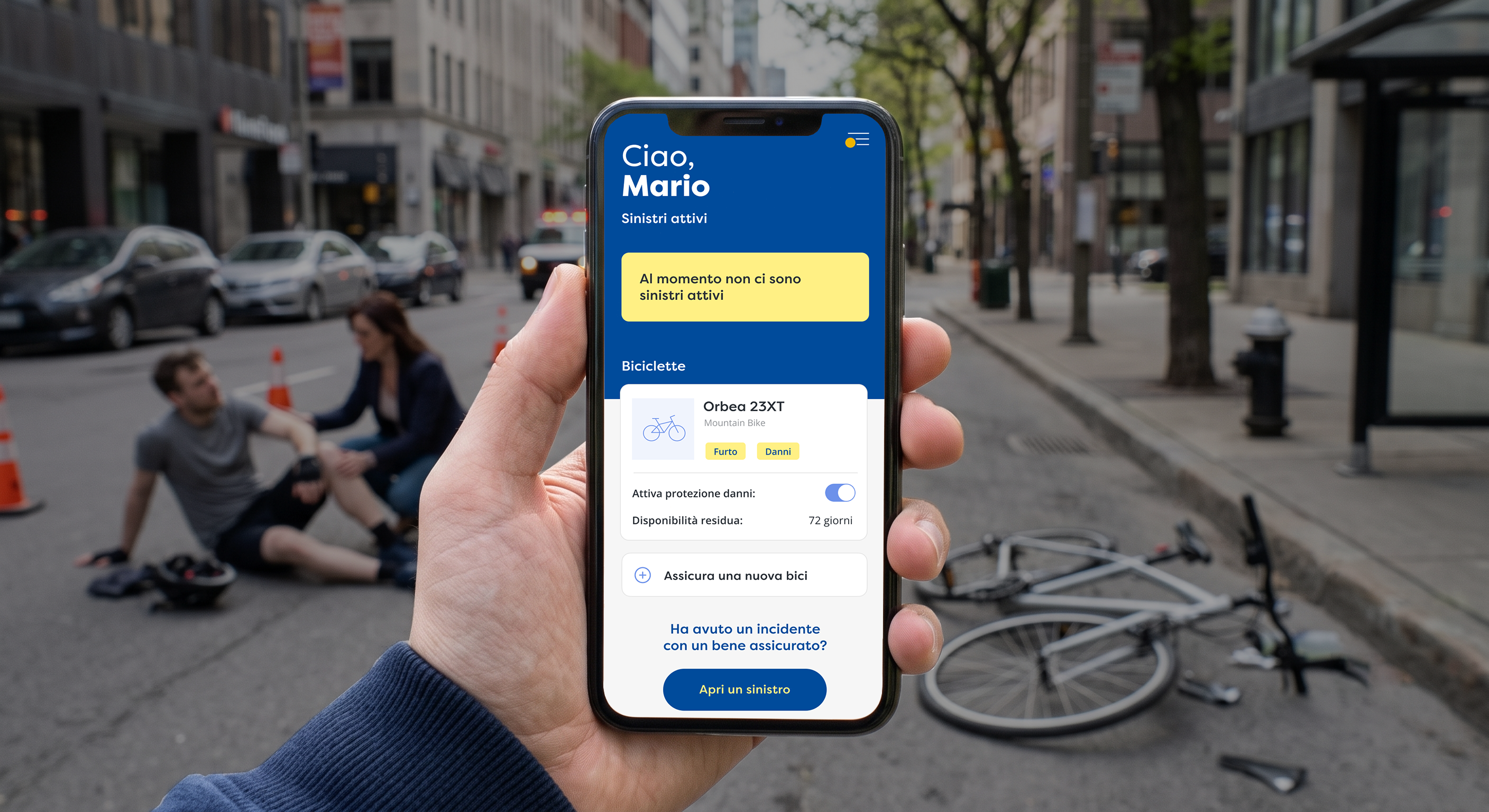
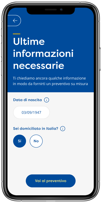
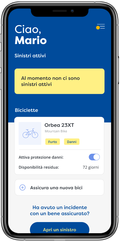
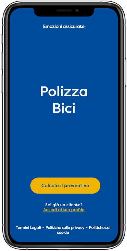
Redesigned onboarding, welcome screen, quote request flow, home & policy management dashboard, and claims management — all resolved into a market-ready MVP.
Onboarding, homepage & claims flow redesigned into a usable MVP
90 usability issues addressed from heuristic evaluation
Supported Reale Mutua's entry into Italian digital bike insurance
Stakeholder interviews, competitive analysis, field research, and user interviews to understand real pain points and business context.
Facilitated workshops with cross-functional teams, mapping current experiences and defining opportunities together.
Low-fidelity wireframes for fast alignment, then interactive prototypes tested with real users before moving to visual design.
High-fidelity screens with accessible, scalable design systems — consistent components, typography, colour, and interaction patterns.
Moderated sessions with real users to validate flows, uncover friction, and iterate before delivery.
Supporting UAT, first deployments, and documentation — smooth handover and onboarding for real teams.
I've designed digital products across defence, insurance, oil & gas, and more. Let's talk about it.

 axel.roncoroni@gmail.com
 +39 340 713 8265